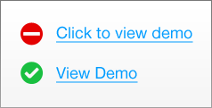
You want users to take action and click on something, but not sure how to get them to do it. You will be tempted to write "click here" for the link, but this will have a serious negative affect on users experience with your website.
Ambiguity
The only thing that is less helpful than a link that reads "click here" would be a link that reads "click something".
By the time a user sees the link, you are assuming they know exactly what the link will do and that they have the context in the front of their minds (meaning the user didn't scan the page). Now I'd say a low estimate of 100% of your users will not fall into this assumption, and your nice "click here" link will negatively affect the user experience to some degree.
“Click” Emphasizes Mouse Mechanics Too Much
I'd argue that using the word “click” takes the user's focus away from the interface and onto their mouse. Rather than immersing the user in the content, you are forcing their attention off of your content and onto them and what to do with their mouse. This also might make a user feel stupid by suggesting they don't know how to use a mouse or what a link is.
Choose another immersive verb that focuses on action, but keeps attention on your content.
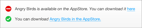
Don't Hide Your Links
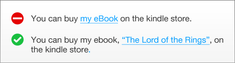
Placing links in the middle of a sentence is a bad idea. The user will either have to memorize what the link does and where it's located, or read the sentence to the end, then jump back to the middle of the sentence to find the link. It's better to just end the sentence with a link. That makes scanning easier, and the user does less work of memorizing and finding your links. The only exception would be a user experience decision for WheresWaldo.com
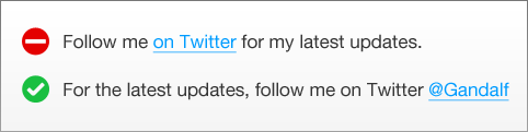
“Here” is Implicative Functionality at Best
Many links say "here" instead of "click here". But unless the user is reading all of the text surrounding the link, they will have no idea what the link does. This is especially confusing for the majority of web users who skim and scan pages to find what they're looking for.
In a long string of text, the user may see the link, then have to jump back and re-read the sentence for context. The second example explains exactly what the user is getting when they click.
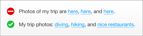
Rather than peppering your page with blue "here" links, make the links nouns to explain what the user is going to see.
Speaking of nouns, try to make them specific. The goal is to never let the user guess anything.
Get Creative
Don't be lazy and write "click here". Heck, mobile users don't even click anything. They tap - and you know it's silly to have a link reading "tap here for more info".
Be smart about your links. Every click on your website builds confidence and trust in the user, which ultimately leads to more conversions.
If the user is having to "figure out" something on your website, you're probably doing it wrong.
How do you choose what your links say? When do you think verbs vs nouns are appropriate? Should some links say "click here"? Let me know in the comments.