Barring the fact that "the fold" is an arbitrary term, and having content appear above the fold could actually harm your conversion rate, there is, in fact, a way to completely control where the fold appears on your site without using sorcery or Jedi mind tricks. This works regardless of the device you’re using. Better yet, this method works on [almost] any browser (IE 9+). You can visit a site on your shiny new iMac at full screen, an android phone. Heck, open the site up on a Motorola Razor or a dang Tamagotchi and your call to action will be right there.
How is this accomplished? Height?
You may be thinking, “Bro, just use height: 80%; and you’re good.” While widths in CSS are as easy as pie, height rarely seems to act how we expect.
Side note, there is no such thing as "heigth"
Wouldn’t it be nice if .foo { height: 100%; } did what we wanted it to do? But that rarely works. What normally happens is you have to refer to an actual unit, such as px or em, and do a ton of math to account for your nav bar or app drawer height in order to get the focal or hero box height and positioning to do what you want it to. This takes more time to develop and I guarantee you’re forgetting several edge cases that will break this implementation.
How does the height property work then?
Setting the height property as a unit, such as px, is pretty straightforward and works as you expect. Using percentages is where it gets tricky. You must set a height on the parent container in order for the height of the child to be respected. An easy way to remember this is children who don’t have parents typically lack respect.
The parent container may have any unit and the child percentage will be respected relative to that. However, and this is a big however, the child’s immediate parent must have a height defined. For example:
- // Totally works
- .parent {
- height: 200px;
- }
- .child {
- height: 100%;
- }
- // Nothing to see here.
- .distant-ancestor {
- height: 200px;
- }
- .child {
- height: 100%;
- }
If no parent height value is set, the child’s percentage will be set to auto. *bonus tip using the height property at the end of this post
How do I make the height relative to the device or DOM?
There is a lesser known unit set available to all browsers IE9+. That is the “Viewport” unit set. They are
- vw = % of viewport width
- vh = % of viewport height
- vmin = vw or vh, whichever is smaller (vm on IE9)
- vmax = vw or vh, whichever is larger (IE10+)
This relies entirely on the user’s viewport and completely ignores parent height or lack thereof. For example, if the viewport is 10in tall, 1vh will appear exactly 0.1in tall.
What does this mean?
- // Your standard giant-text-over-huge-image-we-make-business-things-happen section below the navigation
- .hero {
- height: 60vh;
- }
- // Markup to appear below the Hero section.
- .call-to-action {
- height: 30px;
- }
That’s it. No matter what size the viewport is, your hero section will never go past the fold.
Some Caveats to Consider When Using This Method
Mobile design poses the largest problem to this. Long sections of text may overflow beyond this container. Something I’ve done to combat this is:
- Responsive design:
- Set a min-height on the container using px or em
- Theme the typography specifically for mobile.
- Mobile specific design. Instead of responding to the device, you can respond to the user and design specifically for what they are wanting.
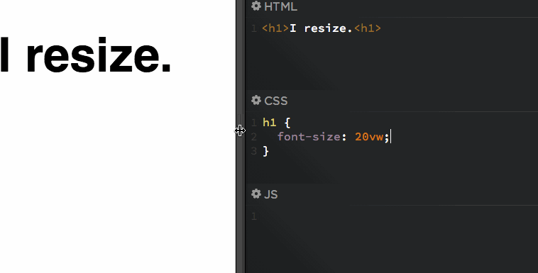
Responsive Typography Using Viewport Sizes
One safe bet to keep typography running well is using vw for your font-size. This virtually ensures your text will never flow past its container. Take a look at the gif made by Chris Coyer to demonstrate this:
Bonus Tip: Prevent Elastic Scroll or “Overscroll” on Web Apps
If you’re developing an app that runs on a browser (like Slack or Todoist), you’ll notice that when you scroll fast in either direction, there’s that elastic effect that makes the application scroll into -x units. Nothing will kill the feel of your snappy web app more than this elastic scroll effect.
To prevent this, we can fix the size of the container to the size of the viewport, then set the child to scroll.
- // Fix the container
- html, body {
- width: 100%;
- height: 100%;
- overflow: hidden;
- }
- body > div {
- height: 100%;
- overflow: scroll;
- -webkit-overflow-scrolling: touch;
- }
Tadaa! No more elastic scroll, and now you have a snappy web app that feels like a native app!