As the designer here, I like to think that I am somewhat of an expert on what will and will not get sent back to me to get re-designed. I've seen a lot of our clients submit designs for us to implement, which really means they go through me to fix things before the developers will code them in. Here's a few things I have noticed that are fairly elementary mistakes.
1. Not using vectors
The reason for this is simple. If the developer needs something re-sized, it will have to be redesigned from scratch if it was made using pixels. Vectors don’t have this problem.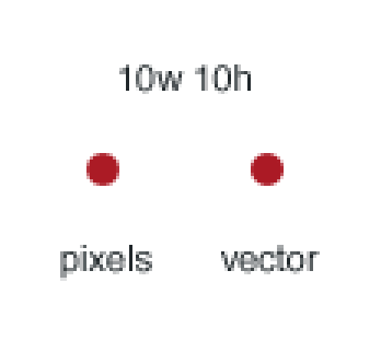
2. Using vectors wrong (the dreaded "half pixel")
Our developers spent an hour talking to a client’s designer trying to explain that the image was 1/2 pixel off. Of course this is technically impossible, but if you are using photoshop, it will alias the vectors' edges to attempt to fill in the missing data. Below are some images to help me explain aliasing:
 The letter to the left is anti-aliased, the one on the right is aliased where the missing pixel information is filled in. Now when you improperly create a vector based image in Adobe Photoshop, the same thing will happen. Take a look below:
![]()
![]()
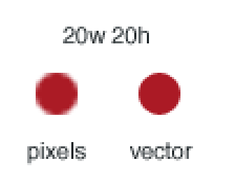
The above images show how the edge of the vector falls between actual pixels, creating an unwanted aliased effect. This also means that if the square above is supposed to be 100x100, the actual rendered file will be 102x102.
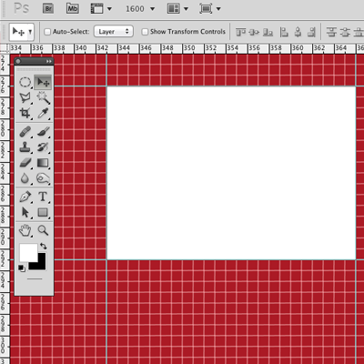
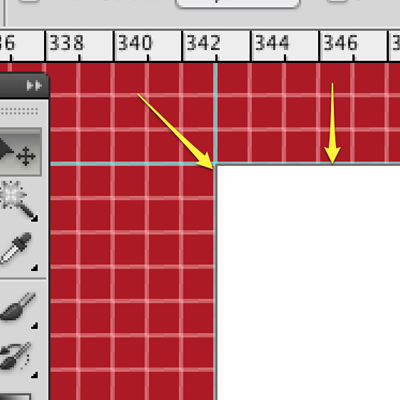
The solution to this is to use guides. Take a look below to see how much better it looks with guides.
3. Massive color schemes, or worse - no color scheme
No matter what your designer says, chances are you don't need 15 different shades of blue. Try to whittle the colors down to a bare minimum, and stick to that color scheme. Now your minimum will no doubt look different than the next company. We have just seen websites that use 8 different shades of grey for drop shadows and lines that should be consistent throughout the website.
4. Images that suck in IE
For a long, detailed, nerdy explanation of image optimization, you can check out this article. Below is just one example of poor optimization.
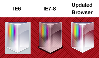
One great fix for this issue is to run the images through a tool called "Image Optim". It reduces file size oftentimes by 30% or more, and it fixes a lot of pesky alpha issues.
5. Exporting with simple CSS attributes in the image itself
This includes, but is by no means limited to:
- Embedding text onto images like buttons. Really?
- Putting a stroke or border around an image. Let the browser handle that.
- Images and icons with the background color in it. No.
- Worse yet, using images for solid-color elements.
Seriously. Let the browser do all the work for you, and don't waste your time doing things that CSS can handle. The most obvious benefit of letting CSS or SCSS control these things is if you want to make a change, your designer doesn't have to do any more work. All the developer has to do is change one part of one line of code and the change is made across the whole site.
What about you?
Do you have any stories about poor design practices? Is there anything on this list I missed? Let me know in the comments.