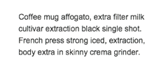
Black Text On White is Easiest to Read
There is more to readability than contrast. Black text on a white background is easiest to read because of how our eyes interpret visible light. White stimulates all three types of cone cells in the eye in near equal amounts. White light emitted from a screen is diffused—or scattered—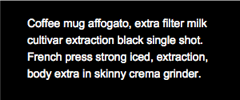 so it appears to blend into the pixels around it. Black, on the other hand, doesn’t emit color and so does not diffuse in the same way.
For this reason, it is easier for our eyes to see details (such as text) when a darker color is shown on a lighter background. When white text is shown on a darker background, the white light is still diffused, so appears slightly blurry. To keep your visitors engaged longer, use black text on a white background.This blur creates eye fatigue, and thus causes your visitors to become fatigued and their attention span to decrease. Without even realizing it, they are moving closer and closer to leaving your site.
Very Dark Gray Can Be Better than Black
To keep your visitors engaged longer, use black text on a white background.
Use very dark text on white or very light backgrounds for best readability.
Because black text can be very harsh looking, using dark gray can help to decrease eye strain. This is especially true for those with who are dyslexic (5-6% of the population) or have a stigmatism (13% percent of the population). In order to combat this, using a gray which is 20% lighter than black can aid in readability across the population.
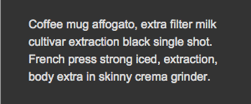
Dark Gray on Light Gray is Better on Darker Themes
In a darker color scheme, using dark on light is still better for readability. To maintain a better consistency without compromising readability, you can use a dark gray on a lighter gray. Without decreasing contrast too much, you can prevent eye strain by forgoing the very bright background with a more muted one, and using dark gray text.
Do This:
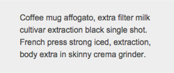
This if you have to:
NEVER This: