Where’s the best place to put your navigation? There are two places that are by far most effective. The reason for this, again, is a pattern established long before the web. Sometimes things shift over time—sure—but there are some truths that simply don’t. This is one of those areas that will never change.
Primary Navigation Belongs on Top
No, this isn’t just because everyone else on the web is doing it this way. Although that alone would be enough of a reason, this comes back to ingrained training over years.
If your site is in English, your visitors read left to right, top to bottom, in a linear fashion (just like you’ve read this white-paper!). This is how they look at your site. They start at the top left of your page, and in a fraction of a second they take in your site and orient themselves, browsing top to bottom, left to right. This is why this won’t change as the web continues to shift; we can’t shake these patterns solidified in our brains. This is one thing we’ll can depend on to help orient users.
This pattern in how we’ve been reading our whole lives kicks in and helps us to make sense of the site. When we’re looking to navigate, we make many quick fixations on the menu, scanning from left to right. For this reason, it is important to put the content your visitors are looking for most often on the left of your primary navigation.
Note: In right to left languages, and ideographic languages, the opposite is true. Visitors browsing in these languages start at the top right of the page.
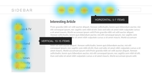
Use 3, 5, or 7 items in your primary horizontal navigation to help keep your menu easy to take in.
Limit Your Primary Navigation
Because your primary navigation is critical to orienting your users, it’s important to keep it short to reduce the decision points for your visitors. Visually speaking, odd numbers are more appealing. Groups of 3, 5, or 7 items are also easier to take in.