Why the Header?
Before, the header and navigations that Precise Hearing was using was using a lot of real-estate and lacked in usability. There was a ton of white space, an overly blurry logo, and a lot of content on the right side that was cluttering up the page. The navigation itself was fairly small, and readability needed some improvements.
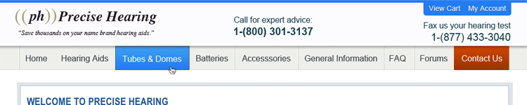
Before:

What We Did
- Shrink the overall height. Their demographic is mostly using older monitors with a lower screen resolution. I wanted to get more information above the fold (where the browser window cuts off at the bottom) as I could. By shrinking the height down We managed to get roughly 10% more information on the screen, including their important calls to action.
- Clean up the header. I cleaned up the existing logo (which may possibly get overhauled in the future), threw in some nice color, de-cluttered the right side, and increased contrast for readability and navigation. It is more clear what is and is not a button, and the user will no longer feel overwhelmed (and subsequently ignore) all the information up top.
- Increase size/contrast of navigation. It is now more clear where you are, where to go, and how to get there. I made the buttons more readable, and the new color scheme really works in the user's benefit to help them get around and know where they are at.
- Changed the website to full width. Granted, they do not have a full width slider, but even with the navigation bar spanning the page, it looks much better on larger browser windows. The whole page looks less empty.
- Call to action front and center. After talking with the folks at Precise Hearing, I found that significant step in their revenue stream hinges on landing a phone call with their clients. Knowing this, we all felt it appropriate to have their phone number centered on the header. It helps fill up some of the white-space without it feeling cluttered.
After:
What's Next?
Our friends at Precise Hearing were really excited about the launch of their new header/navigation. They're all anxious to see what we come up with next. Since our plan was to start with the most used items on the website and work our way backwards, we are going to do an overhaul of the contact form next time around.