Story time!
Imagine a house where the fridge is right near the front door as you walk in, every room has a locked door that you need specific permission for each time you navigate through the house, and windows along walls and on doors to the bathroom. This house doesn't seem to follow any conventional rules, and you may be wondering why you would want access to the fridge when you enter the house and not in the kitchen (for an immediate snack when you get home, of course!).
This layout doesn't make any sense because the user was left out. While new ideas can be a good thing, the user should be kept in mind for any changes. Their thoughts and opinions are on the front of a UX designer's mind or should be, when building or redesigning a website.
UX Principles to Keep in Mind
While this is not a complete list, it does cover some of the major points that can really jumpstart improvements to the user experience. For more information, check out the book 100 things every designer needs to know.
Groups of Four - While you may want to present all the information at once instead of making them work for it, this can actually be counterproductive. People get overwhelmed when presented with too much information, so it's best to group items four at a time. While it is best to do this with only four items at once, more information can easily be grouped into separate chunks distinguished by color and other design techniques.
Progressive Disclosure - A website should be organized for different types of users, which means not presenting all the information at once. You can present topics at a broader level so that readers who just want a big picture view of your company can see it, and let users who want detail easily discover it. Presenting ideas by peeling back a layer at a time gives the user information in easily digestible pieces that continue to peak their curiosity and interest in your company.
Mental Processing - Some tasks on a website require more energy from the user. Cognitive tasks that involve thinking and remembering put more strain on users than motor tasks like clicking a mouse. By setting up a website that requires less-taxing actions, users don't feel the strain and don't mind diving deeper as long as the content is useful and relevant. This is especially true for a mobile site, where putting things under layers of menus is not necessarily a bad thing if the navigation is intuitive.
Examples are Helpful
I wanted to walk you through some examples of cool websites that still follow good UX principles.
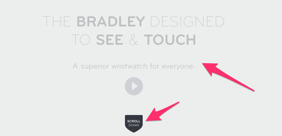
This website showcases a great watch for the visually impaired (go check it out) and has clear navigation. It draws you in with basic information and a video for those who want a quick demo, and then directs you to scroll for more. It breaks some conventional rules, but the learning curve is still an easy climb.
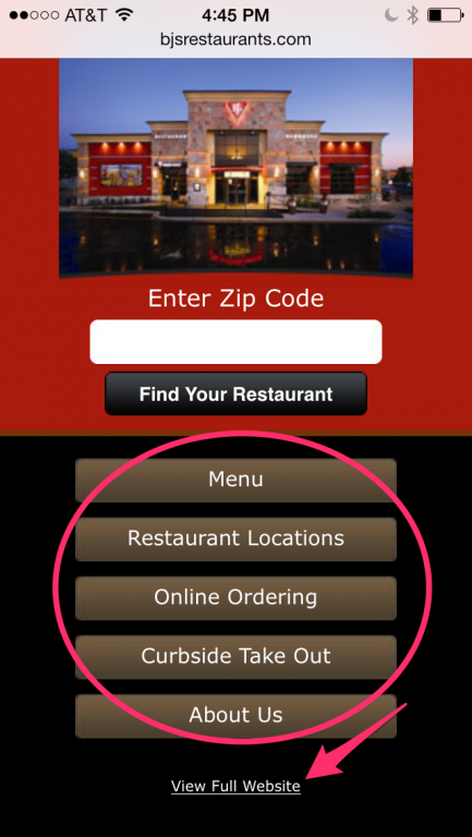
As for mobile websites, the basic principles still apply. Presenting info in smaller chunks simplifies the decision process and builds trust that is key to forming a lasting and profitable relationship.
While more actions are required to navigate through, when these websites provide clear paths that are intuitive, users hardly notice the amount of clicks because they are getting the information they wanted.
Story Revisited
Now let's imagine the house that follows rules while also providing a unique flair. The appliances are where they should be, but maybe instead of just providing basic power outlets, you provide the handy ones with USB ports. It follows conventional rules while pushing modern design with customer value. Windows can still be in interesting places as long as you factor in customer needs. I am not saying to steer clear of flair, but make sure the path to understand it is easy to follow because getting users onboard is how business succeeds.


