If you check out my last post on flat web design, I'm all for it. I think it is a great way to remove superfluousness and focus on pure content.
But have we gone too far?
Where I used Apple as an example of what to do right in the last post, I will use them as an example of what not to do here. Nobody's perfect.
For years, Apple has been doing away with arduous instruction manuals - moving from minimalist pamphlets to only supplying the product with no instructions. I am a big fan of letting the user experience guide the users. The ultimate usability test is throwing the users in the deep end with no context or lessons and seeing if they can swim.
Many flat-ux gurus are taking things to an extreme, and consequently many users are drowning. If you upgraded to iOS 7 recently, you probably experienced some drowning yourself.
The ultimate usability test is throwing the users in the deep end with no context or lessons and seeing if they can swim.
For example, take a look at the following menu bar from iOS7's web browser. Even knowing exactly how this application functioned, I was almost paralyzed when trying to figure out how to open a new window. What on earth?
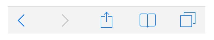
I can guarantee a user new to iOS, or smartphones, is going to have a difficult time guessing what the functional response of a square with an arrow on it is. This is where not having any sort of instructions or guides can harm users. Even a 1 minute, skippable guide orienting users to the new icons would provide them with some UI floaties to keep their head above water.
Frustrating UI
One of the reasons that got users so frustrated was that the icons that got changed, although aesthetically were wonderful, gave zero information on it's functionality.
Even people like myself, power users familiar with iOS since the first iPhone, were confused as to what the buttons did and how to accomplish simple tasks. I truly pity first-time iOS users everytime I try to share a photo. I feel like I'm drowning in the deep end of the usability pool - Lord only knows how they must feel.
What gets designers and architects into trouble is assuming users are content with the trial-and-error method of figuring out your "beautiful" new flat user interface. Everyone learns differently. Some people like being thrown in the deep end, while others will read swimming books before taking a swim class. The difficulty, then, is creating a system that caters to both crowds.
A Better Solution
I propose to those designing flat user experiences to design a way to teach users how to swim. Don't let the pendulum swing so far to the side of minimalism that you forsake the user experience.
You are designing for someone on the other side of the screen.
One practical way to approach this design is to allow users to choose the level of information they wish to see. Start out with your web app showing all labels, and give the user options to swap to tool-tips or remove labels altogether once they have mastered your system. Take the following image as an example:
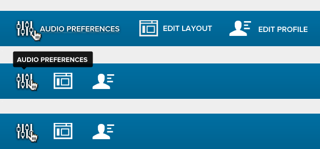
You get several big wins with this:
- The users are in complete control of their experience
- They are not forced to figure out an allegedly intuitive system
- Users can revert in the event they forget (say they don't use your app for a number of months)
Of course, this isn't the only way to tackle the issues with flat design, but it's a way to get the conversation started. Again, I'm in favor of flat design, but not at the sake of usability. At the end of the day, you are designing for someone at the other end of the screen; and if it doesn't meet their needs, the design itself has failed.
What about you?
What problems have you faced in interacting with flat design? How have you seen those challenges addressed? Let me know in the comments.