This is the third and last post in the Colorado University review series. This time, we will cover Pikes Peak Community College, PPCC. I will also cover their content strategy and information architecture to let you know how I like their site and how easy it is to use.
Is the Content Relevant to What I Need?
Finding that the main menu is on the right side of the page, I find the categories lead to where I most likely want to go. The main menu on top seems to be a subtle effect with more emphasis placed on the sidebar menu, but still has relevant information under general categories.
I even found that the slider is very relevant. (No, I am actually NOT joking on this one)
The pictures are about various students, and the captions/titles show value for the user with things like "Affordable" and calls to action below them. This site seems to provide lots of navigation options for the variety of users on the site. Becuase I know the types of students that go there are busy and school is not the only thing they have going on, making navigation easy is really key.

Can I Find What I Need?
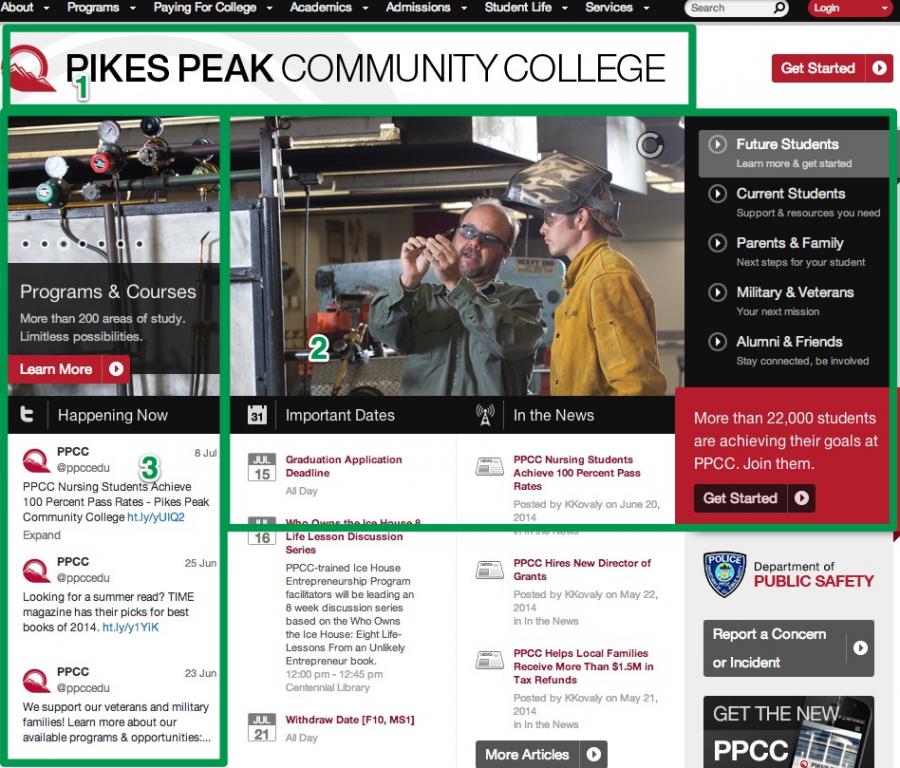
On first entering the site, I realize they used the F-shaped pattern to design the site. As you can see with what I outlined in green, this is the general "F" that the eyes of users follow. My eyes go to the title of the site (1), letting me know I am in the right place. I track over to the right to see the menu (2), and if I don't see what I want, my eyes follow back to the left and I start scrolling (3). When I run into the twitter feed, I am disoriented because it is placed in an important position yet is probably not relevant to my journey.
One last comment are to notice that the quicklinks are located in the footer of the site, which seems counterintuitive as that is usually where things of lesser importance are placed. If they are supposed to be quick, why are they placed out of the way?
Should Anything Change?
I would consider putting the Quicklinks in a more obvious location to make it more obvious. If the side menu is the main menu, consider moving it to the top.
With the site being structured using the F-shaped pattern, I would suggest moving the Twitter feed to a place not in the direct path of a user's eyesight. Maybe putting something else of higher importance would be more effective, like the Quicklinks.