If you haven't read the intro post, this is the second post of the Colorado University Website series. In the first review, I covered Colorado College. I am now gonna give my thoughts about the University of Colorado at Colorado Springs website.
Does Content Pertain to Me?
I want to give a disclaimer and say that UCCS is my alma mater and as of this writing, I am still there getting my masters so I am trying to be as objective as possible.
As a visitor, student, or faculty, I see links to apply, get to my student portal and get event information. Most visitors probably come to research programs, which is easily available with the top navigation and menus below the fold.
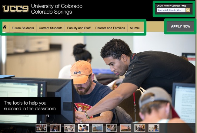
As a student, I find quick access via Quicklinks to get to my student portal or get help with registration. Out of all the tasks students need to accomplish on the website, the most popular are course information or class planning. I probably wouldn't want to know about all the professors and their research instantly, so it's not listed on the homepage.
Can I Find Everything I Need?
The top navigation has the categories expected from a university website, so I can pick the right tab and continue on my journey. Having a couple different navigation options, such as the Quicklinks (1), top menu (2), and search bar (3), UCCS captures the purpose of multiple user stories.
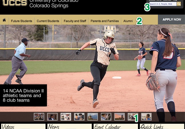
Clearly, UCCS did their research in knowing what tools are used most and what types of users are on their website. They provide different navigation options to accommodate all user types. Navigation-oriented users can pick from the three options I mentioned above, and search-oriented users have a search box at the top to find what they need.
There are few distractions besides a slideshow and a twitter feed. While I wouldn't recommend having the twitter feed as a top priority on the home page, if at all on the site, I find the events calendar useful and relevant.
What Would I Improve?
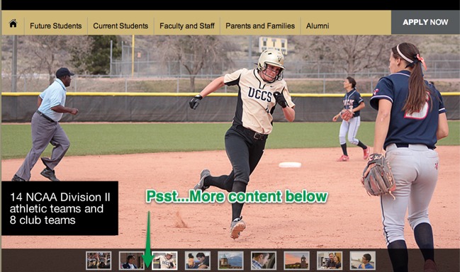
I would consider shrinking the size of the image slider, as it takes up most of the page above the fold. This can confuse visitors into thinking they only have the top navigation or search bar to choose from. If it were smaller, the content below the fold would peek out more and encourage students to scroll. Right now, users might have no idea of the existing content below the fold and would only find it by intentionally scrolling.
Overall, I would say the homepage is fairly simple while still providing many doors to every piece of the website. Distractions are minimized to allow the user to take action quickly and easily.
Stay tuned for the next and last post in the series, Pikes Peak Community College!