If you have read my intro, then you'll know that this is the first review post in the series. For those of you who are new to this series, let me give you some context. I am doing a higher-ed website review for the top universities in our Colorado Springs backyard. This post covers the content strategy and information architecture of Colorado College, CC.
Is the Content Relevant to Me?
When I get to the homepage, I am surprised that there are more pictures than text on the site. There is a simple menu and a middle column of the latest events and announcements about Colorado College.
While most people would opt to cram as much text as possible onto a page, the fact that this site uses pictures is refreshing. It tells me that they want to communicate what life is like at the college. The pictures give a full description of CC life and let me know that their focus is on attracting new students and donors by displaying their accomplishments and student body.
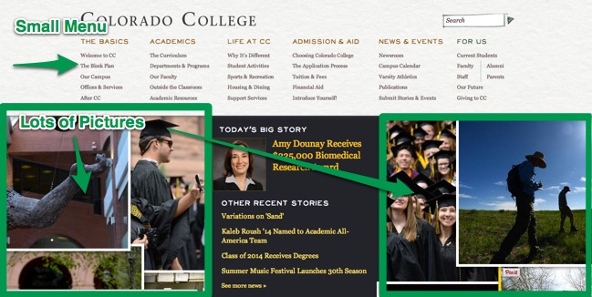
As a visitor, I expected the typical menu and slider, so this new layout is different but I can adjust quickly. The pictures provide a very interactive experience.
Can I get to everything I need?
Even with only one menu to work with, it gives me access to everything on the site easily and quickly. It sticks around throughout the site and stays in the same place, which provides a nice consistency.
As a visitor, I can find all the information I need because 99% of the menu pertains to finding information about the college. The last 1% pertains to current students and faculty, with a small section at the far right that gives them access to things like class information and scheduling.
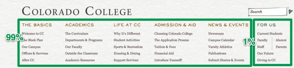
The descriptions on the menu are clear and descriptive of the user journey. The first column describes "The Basics" and the following columns get a little deeper as the user learns more about the college.
Would I Change Anything?
I think the purpose of the site is to provide information to visitors and educate them about the college. If this is the case, I think they are doing a great job. I would just stay up on researching the user. It seems like they have a pretty solid process to build a great experience for their users. Their content strategy gives me a thorough picture of the university and pushes me to learn more.