There is no doubt that phones have gotten bigger and they will most likely stay that way, at least for awhile. For mobile and web designers, this is good news and bad news.
While big phones are now basically the 'norm', it does require some change to meet the new standards. I want to shed some light on the changes that are coming and how you can prepare for those changes.
What Are Thumb Zones?
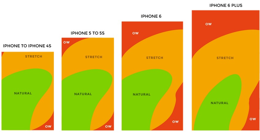
The available area shown in the pictures does change depending on how users hold their phones. If users "choke up" and hold the phone at the halfway point instead of with the bottom in their hand, the natural zone expands. I would caution against depending too heavily on how users will hold their phone and focus more on the basic, most common position as your design starting point.
How Does This Affect Usability?
With smaller phones, thumbs could reach the entire screen easily but bigger phones make that task a little difficult. With there being only a couple main sizes for screens that most phones tend to follow, there are a couple main guidelines to follow.
- Essential items go within easy reach - This applies to interactive items that users always need (user profile, menus, shopping cart checkout) when using your website or mobile app. This means it can be easily reached by scrolling or navigating within the thumb's normal range.
- Non-essential items can go outside of the normal zone - What qualifies as non-essential are things like static content or info that isn't always necessary to get to easily. Ideally, things like settings or help wouldn't have to be within easy reach because your interface is so intuitive and simple.
The goal is to place the essential items within reach, which may require some adjusting. The important thing to remember is that this process is not just scaling the current designs to fit a new screen, but rather adjusting and realigning your content to match user capabilities.